Figure Project
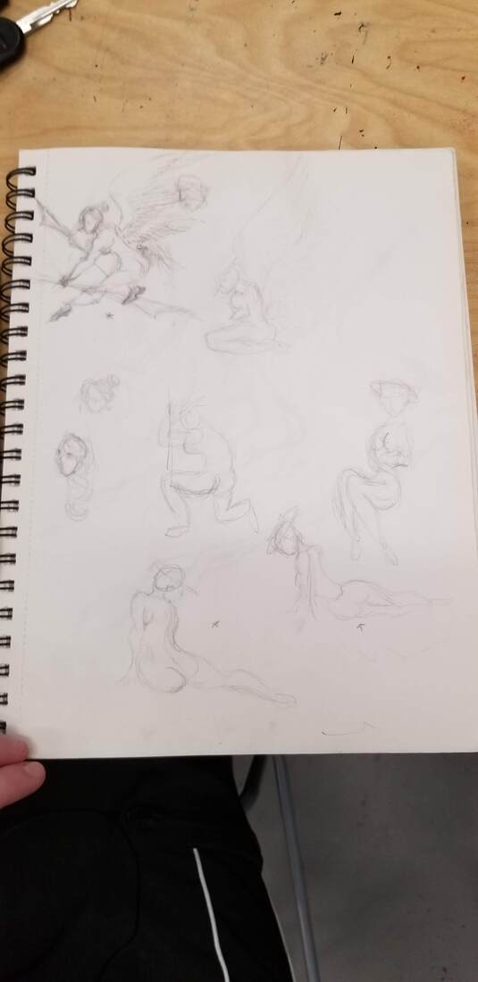
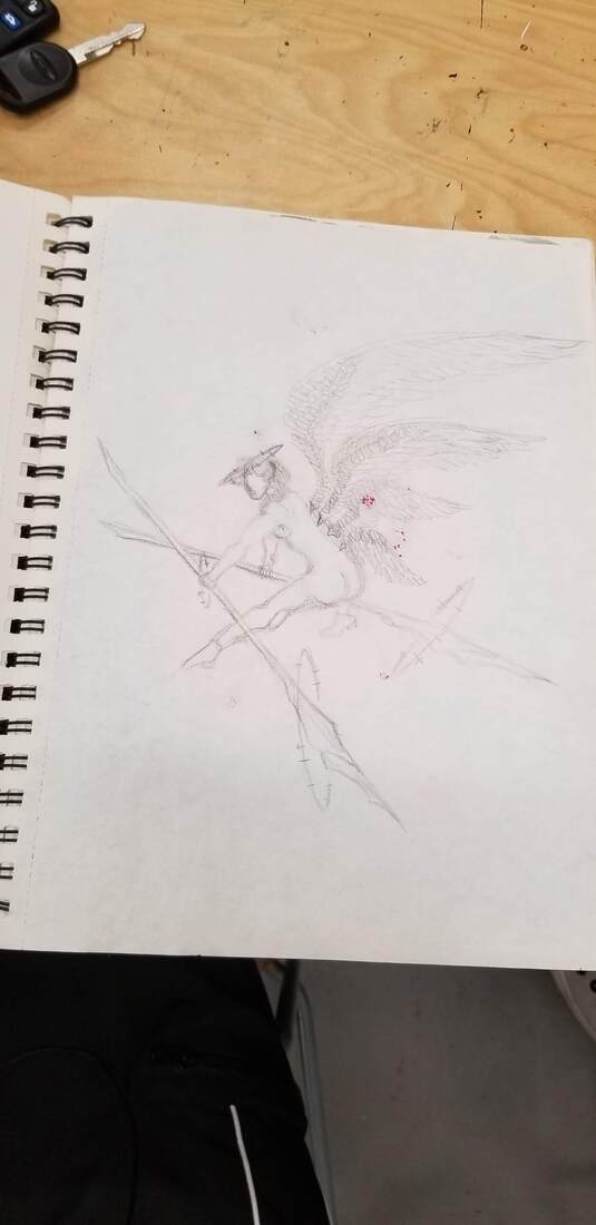
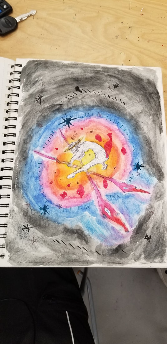
. IFor the figure piece I started with wanting to draw a women because they always seem so powerful and majestic and I really wanted to project that in my piece. I decided to do a watercolor pen piece for this so the figure will feel the center of all the color and beauty. I originally wasn't going to add pen to my piece but the color almost overcrowded the figure and it didn't stand out much. I wish I didn't use as much pen as i did because it drew the attention away from the figure. I would like the viewer to focus on the figure and colors surrounding it.
Characteristic project
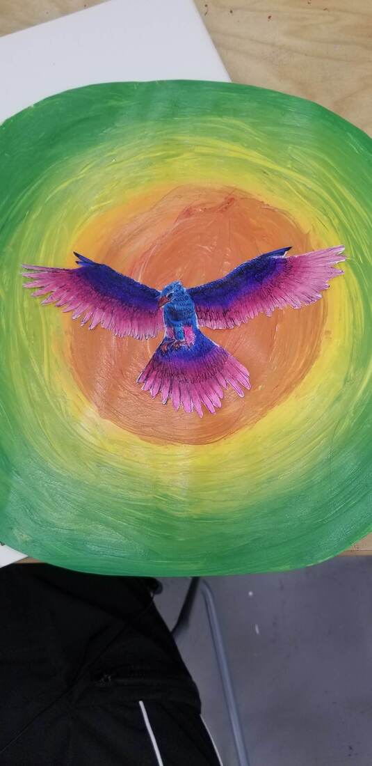
For this character piece I decided to portray the characteristics confidence and bravery. To me the perfect example of these traits was a hawk because they are predators of the sky and they are always fearless hunters. I decided to go for the colors surrounding the center piece again so I could accentuate the hawk making it the main focus. I chose the colors of blue, purple and pink for the hawk because the pink represents a powerful feeling while the blue projects a calm feeling so the hawk could be seen as a brave but almost calm figure. As i worked on this project i had to overcome drawing the hawk and accentuate the details of the feathers of the hawk. I at first had trouble deciding the position of the hawk and how I wanted the colors to flow around the hawk. i would like the viewer to focus on the hawk and why I choose those specific colors instead of its natural colors.
Artists Style
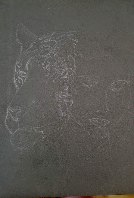
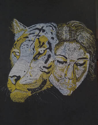
This project is the artist style project and for my artist I chose Yulia Brodskaya because her are combined human and animal counterparts together to create a beautiful piece and I wanted to explore that style more.
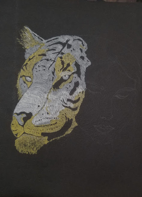
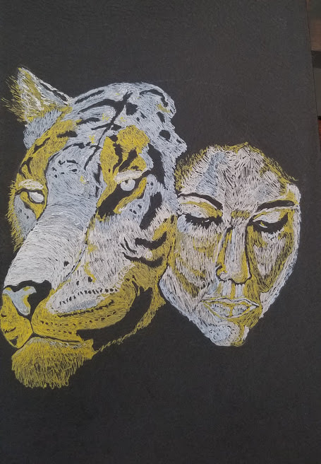
1. For my project I used an old black folder as my paper and I used white, silver, and gold gel pens as my tools.
2. I chose to use a black folder and gel pens because they were the only readily available materials I had at the time and I thought it would match my artists style more. I made the art work the best I could with the gel pens by making each color a different aspect of the piece and using the black background to help since I was only using 3 colors. For the tiger i used gold as the white parts of its fur and silver and white as the shading and coloring for the rest. For the woman I used the gold as shading, white as highlight, and silver as the base.
3. When I started this project I struggled to figure out how to use the little colors I had and still create a lot of detail without blending considering the fact that I was using gel pens. At first I struggled with the gel pens since I had never really used them before and the material of the folder made it harder to draw on with gel pen. Throughout the project I was able to get a hang of the material I was using and I was able to come up with what colors I should use for each part of the drawing. I think the most successful part of my work was that I used the colors differently in the tiger than the women so they wouldn't blend together so much and so I could add a challenge to this project that I could work through and accomplish.
