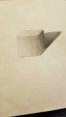
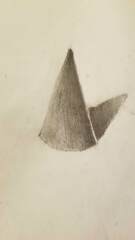
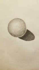
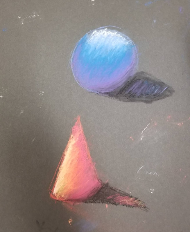
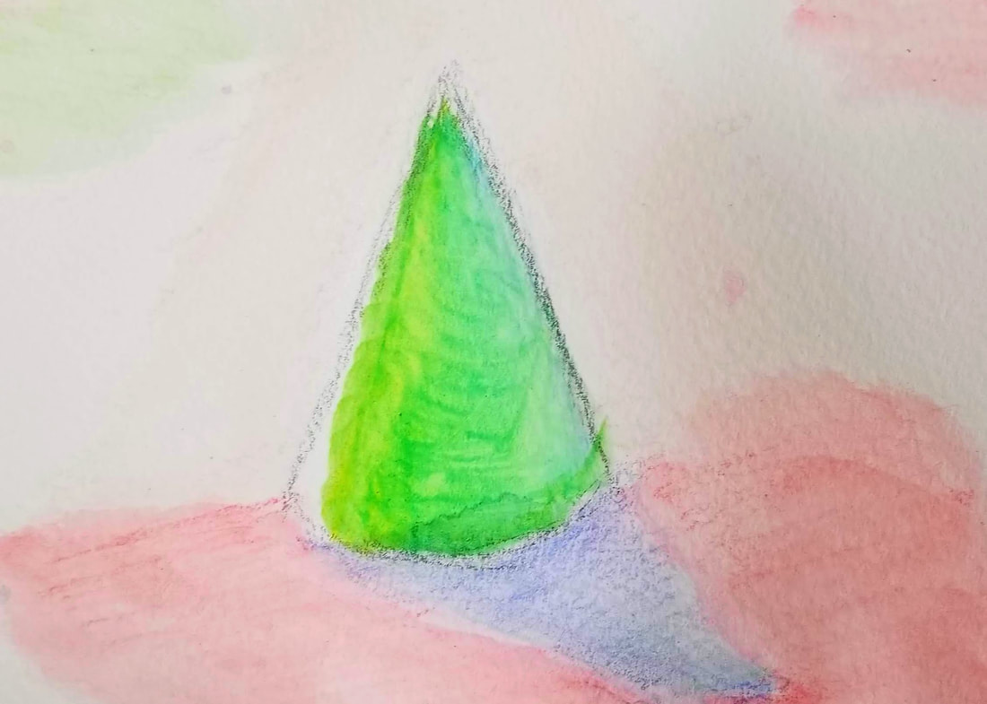
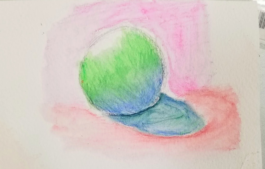
Value
|
|
|
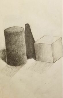
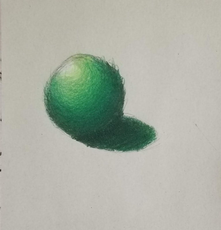
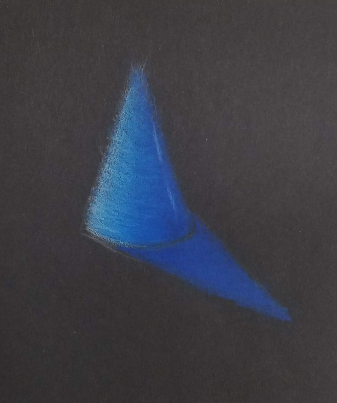
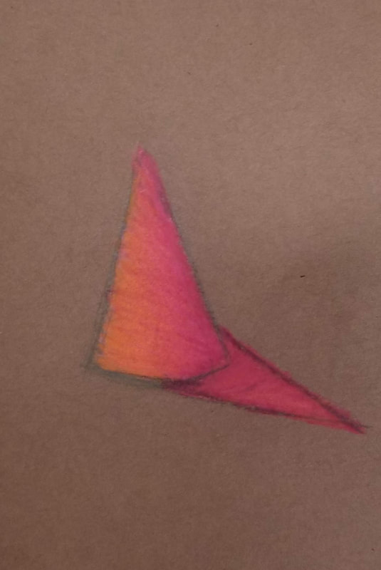
In this project I drew a cube, cone, and sphere to see where I am in shading and showing value. I feel that I need more practice on my value and I need to practice equally shading across the entire shape to give it good form and volume. I feel that with more practice I will be able to show my value better. While drawing these I learned new techniques to help have better form and some value.
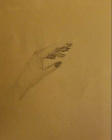
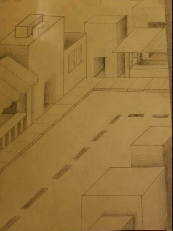
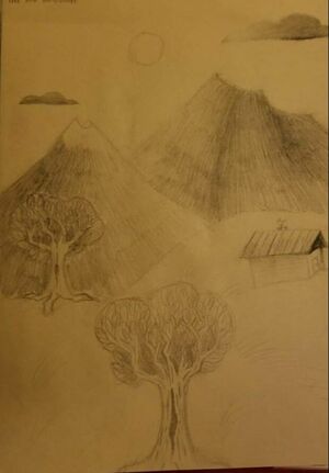
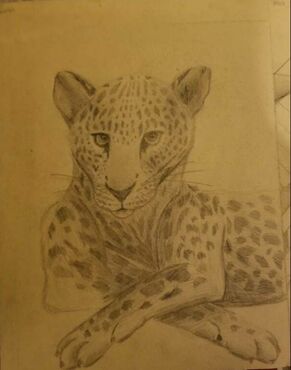
Four starting drawings
|
|
|
|
In these drawings I had to draw a tree and landscape, an animal, point perspective, and my hand. I do need to improve on my shading for all drawings to help add value. On my animal drawing i need to practice more anatomy so i can get the proportions right. I am proud of my perspective drawing but i need to work of shading on that as well. The hand i also need to work on shading and anatomy. Overall i got to practice more with my shading which will help me in the future. I enjoyed drawing all of these and i hope to redo them in the future with better practice.
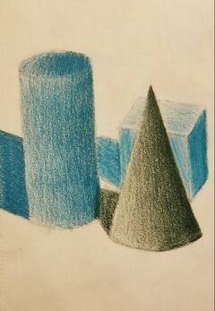
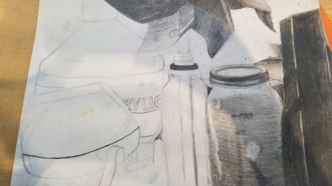
Still life sketch and color
|
|
In this project i drew still life. I like how i shaded the cylinder in the sketch but i needed more practice with the other shapes. Like most of my other drawings i need more practice with value. The coloring with prism colors was hard and a new experience especially with drawing the shadows of the shapes. But overall I thought it was a fun project and i would like to redo it again one day.
Composition starting sketches
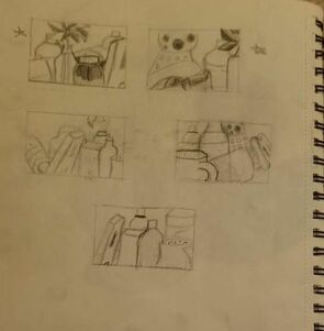
In this drawing we given a table full of items to draw. We choose a small portion of the table to draw. These are compositional sketches for the finished drawing. Out of all the different ideas and drawings I liked the top left the most because it gave a nice and neat look and it wasn't too crowded or centered.
Still life final drawing with questions
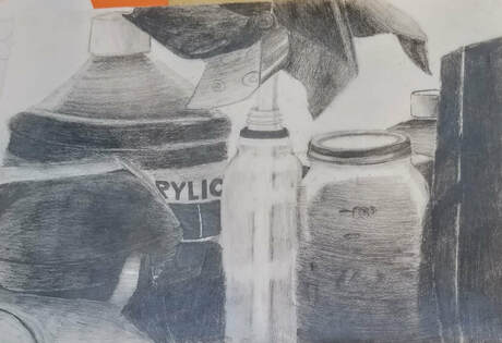
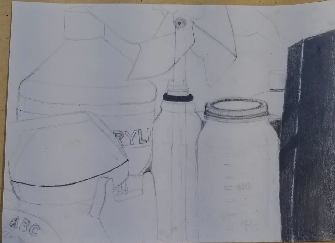
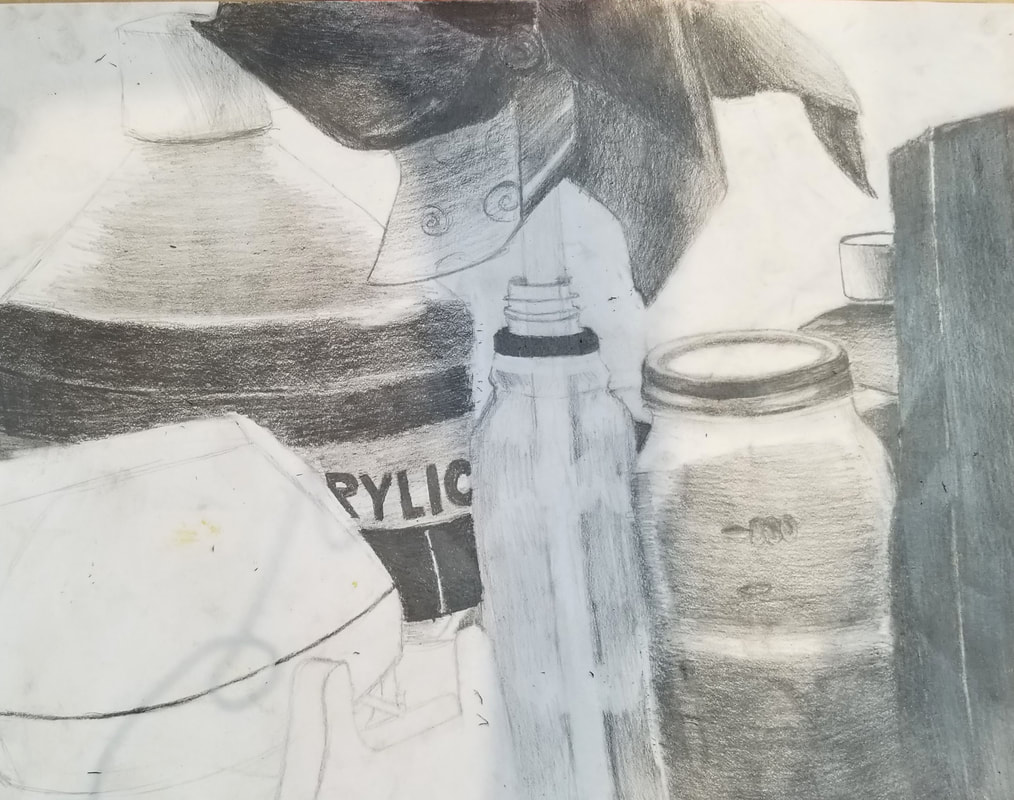
- Describe how you arranged your composition. Discuss your use of the elements and principles. Is it a successful composition? I arranged my composition as to what looked the most appealing altogether without making it look all mashed up in one space or having the focal point be one object. I used 4B, 2B, H, 2H, and 3H graphite pencils for my drawing and a ruler. I think it was a good composition nothing was truly the focal point. The glass jar wasn't as evenly spread out as the other objects and was more in the center.
- Did you use a wide range of values? Explain how is this evident? I think I made my values too dark and I did not add enough contrast making it a big dark blob. This is evident because value creates depth and forms the overall shape of the object.
- Explain how your knowledge and creating practice studies with value contributed to your piece. Practicing value with my other still life drawings helped me gain more control of my pencil, creating a better transition between light and dark. I didn't have much practice or knowledge of graphite pencils but this project helped me better understand how they work.
- Describe the blending and transitions in your objects. The blending in these drawings was hard to keep consistent because I didn't have much experience with graphite pencils to know how much pressure I had to use while creating value. On the statue of the letter A I used a 4B graphite pencil. I used a lot of pressure on that drawing without knowing how dark it was going to turn out. With the glass jar I used 2B and H the create value. This helped me create better value and more contrast cause I didn't have to use a lot of pressure which helped me stay in control. On all of the other objects I used all different types of graphite pencils with what I had learned from my previous mistakes
- Explain how your interpretation of texture is essential in capturing the look of the object. Texture helps create depth in the drawing allowing it to look like you could reach out and touch the object. In the glass jar I tried to create a shiny texture to show the transparency of the glass jar and give its round shape.
- If you could recreate your pieces what would you do differently to enhance the final outcome? If I could recreate my art I would practice with the granite pencils more so then I can figure out which ones to use and when to use the right amount of pressure. If I could recreate this drawing I would also draw some of the objects especially the A a lighter shade to show more value and the show cast shadows of the other objects on each other.
Pen & Ink Sheets
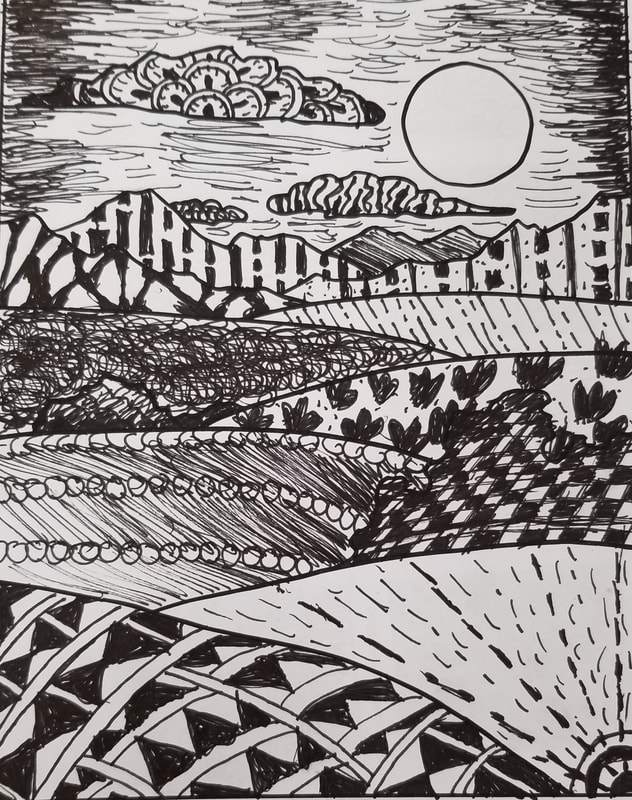
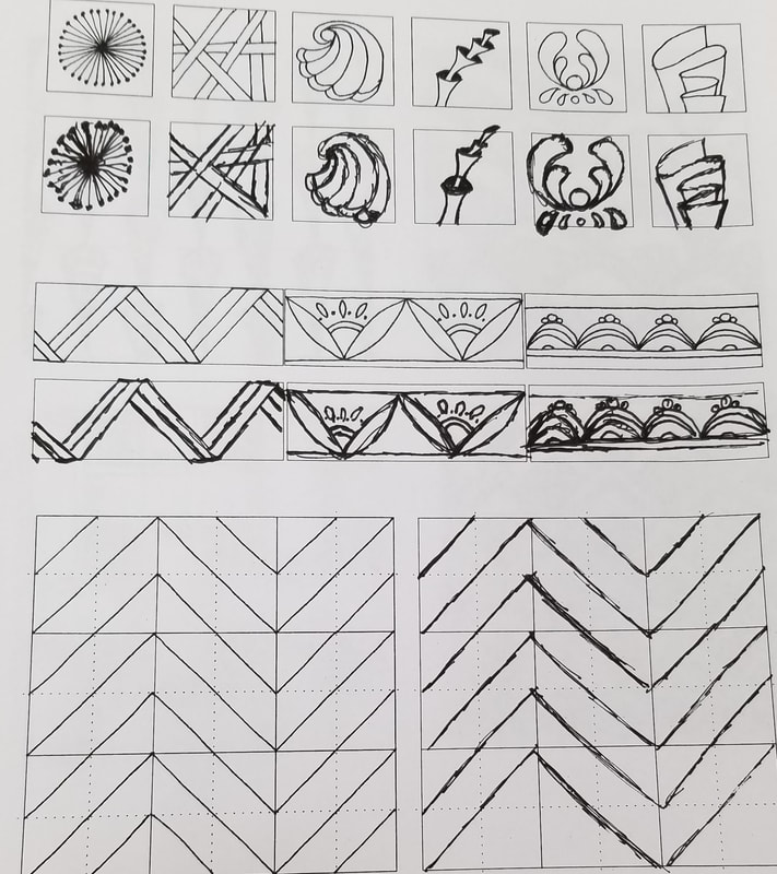
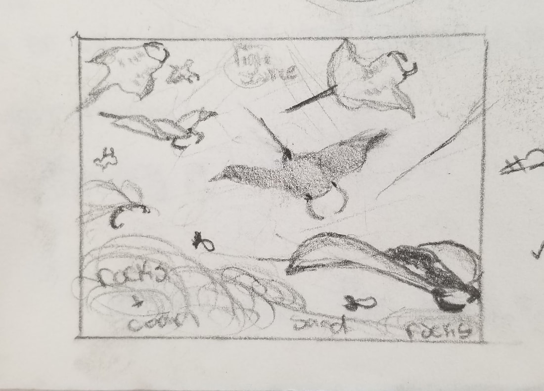
On these sheets we recreated pen & ink patterns and textures. It was difficult at first cause I didn't have a lot of practice with drawing in pen yet. The more i got into though the easier it became. For the top middle picture we had to fill the landscape with different patterns and textures. I didn't add enough contrast with the bush and the hill behind it. This helped me better understand the full value of a pen.
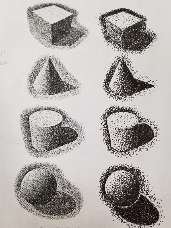
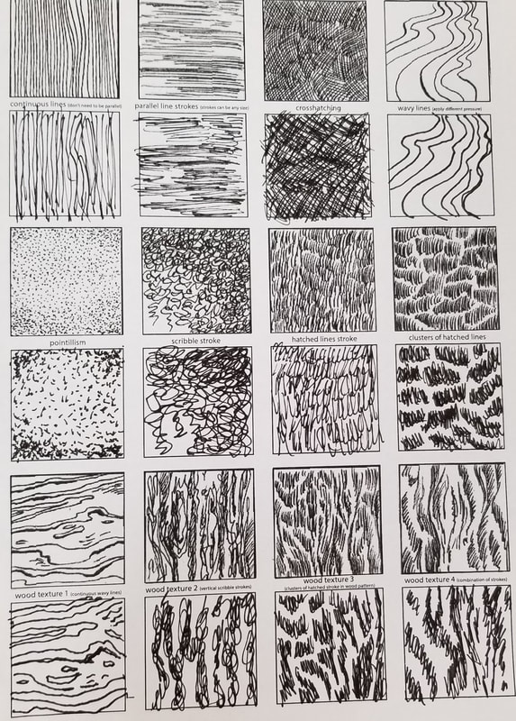
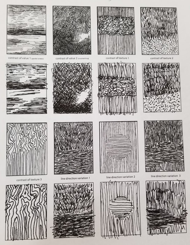
Pen & Ink texture and value
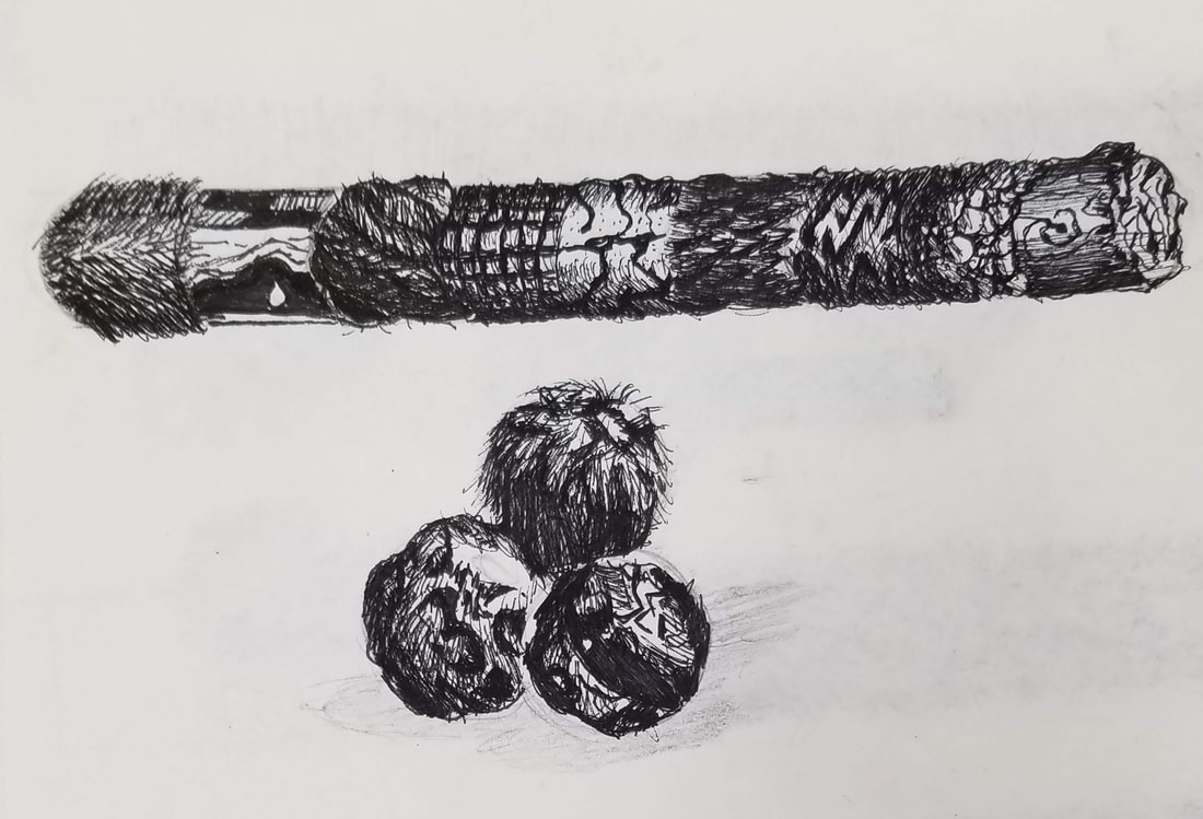
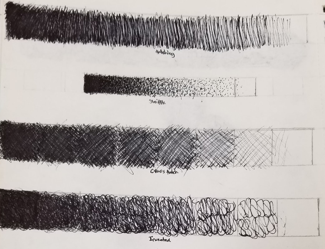
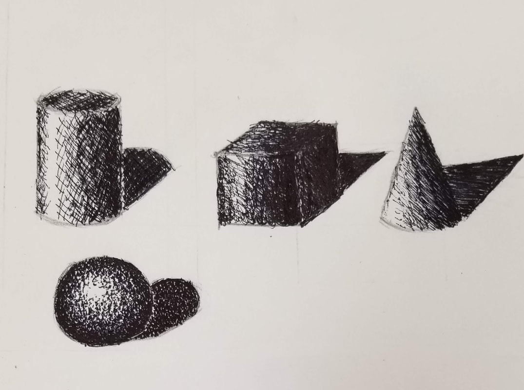
On the far left are 2 texture drawings i drew off of a tutorial video. It was hard to figure out the textures and how to properly shade them. In the middle I practiced hatching, stipple, cross hatching, and invented pen & ink value charts. At first it was hard to create value with the pen but over time I was able to get better control of my pen. On the far right I created a cylinder with the cross hatching technique, a cube with my own invented style, a cone with hatching, and a sphere with stippling techniques. It was hard to figure out the right value for the cube cause of all the different dimensions.
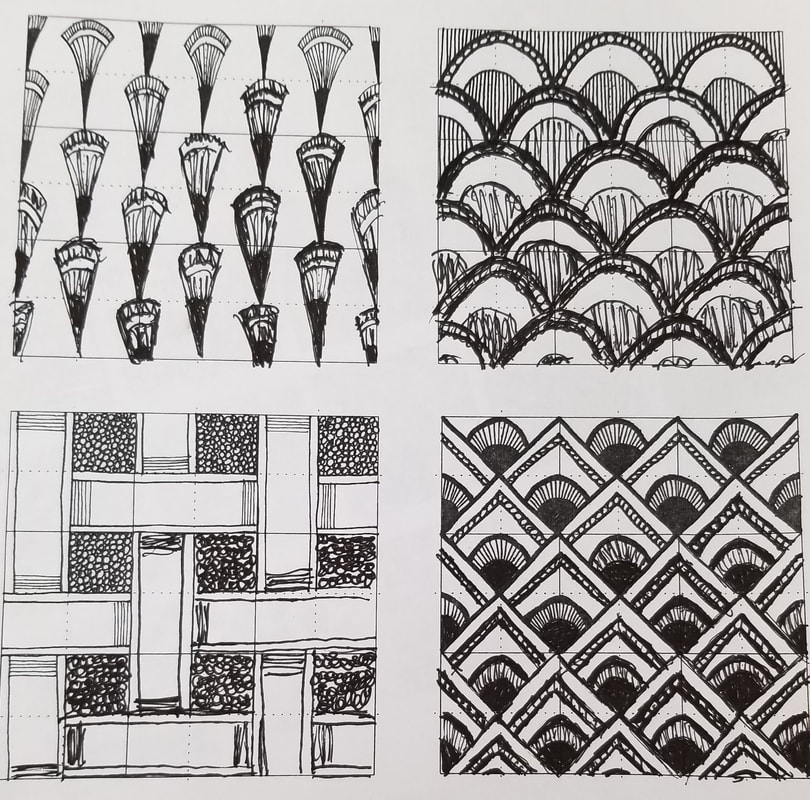
100 Pen & Ink patterns and textures
|
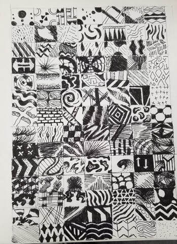
|
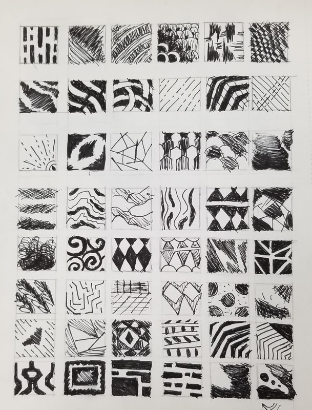
For these drawings we practiced creating our own designs and patterns in pen. We had to create our on designs so we can translate them into our final pen & ink drawing. I made more than 100 drawings because my first few patterns were not patterns I could use in a drawing and they were to light or simple.
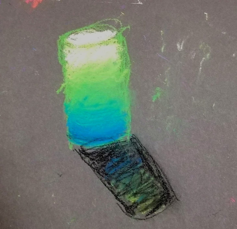
Texture: Cylinder & cube
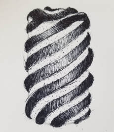
|
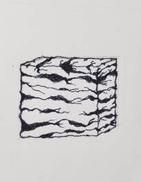
|
On the left I made a cylinder using texture with value. It was difficult to figure out how everything can properly wrap around the top of the cylinder. On the right I made a cube with a cracked texture. It was also difficult to figure out how to wrap the texture around the shape and where to place the cracks.
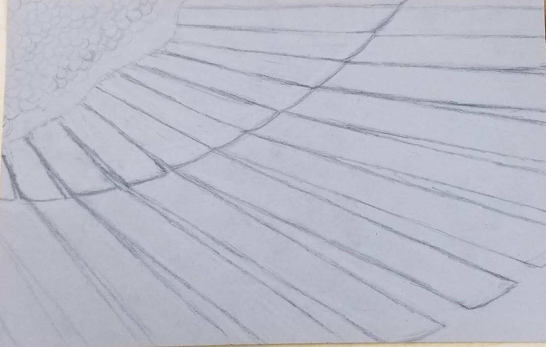
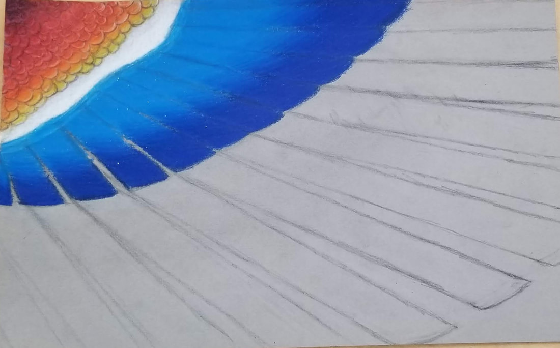
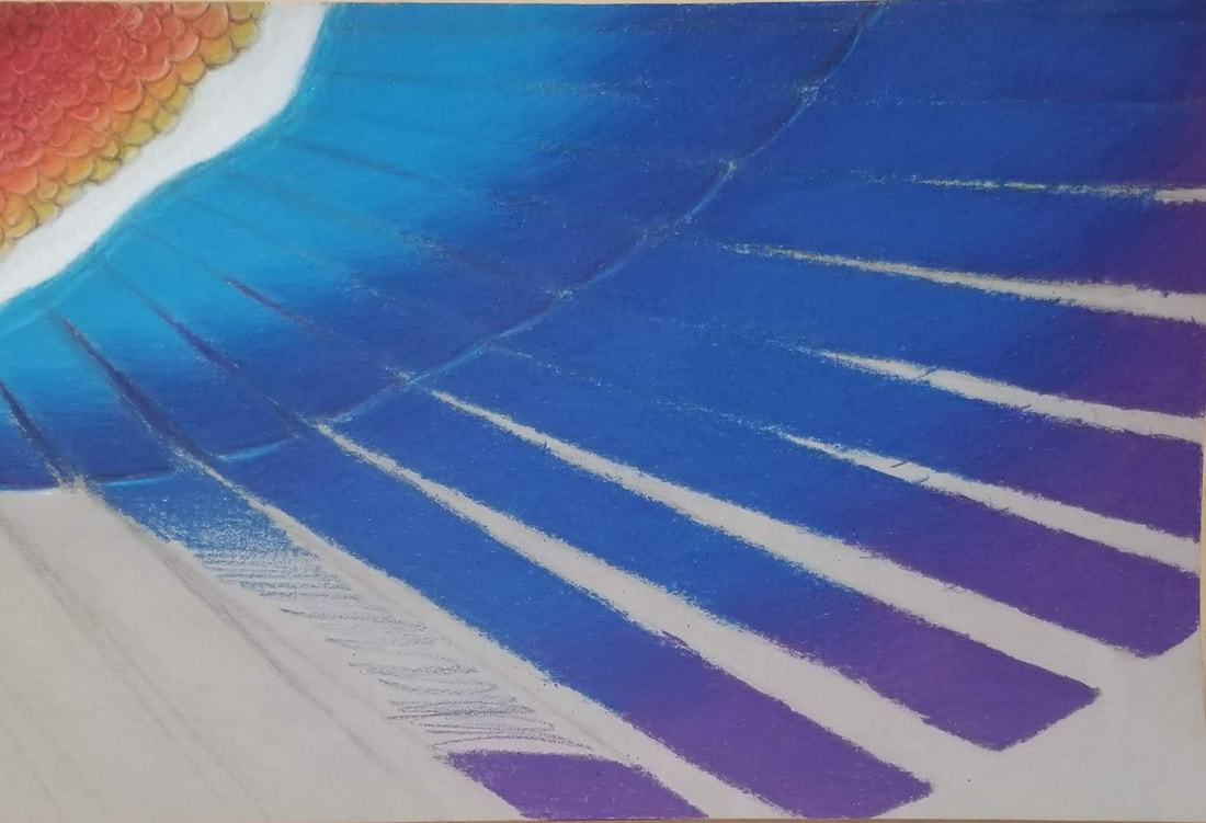
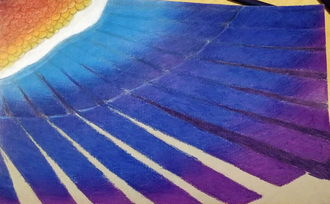
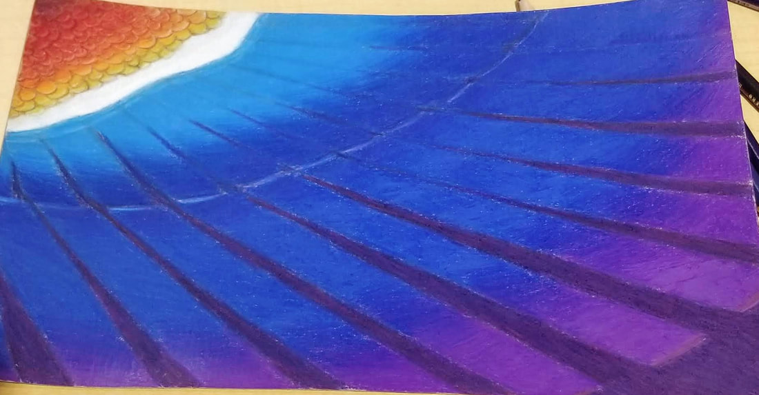
Pen & Ink final
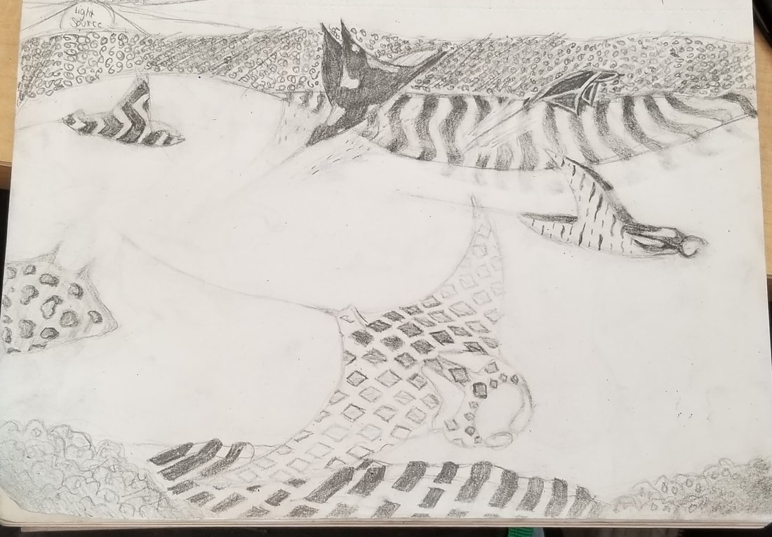
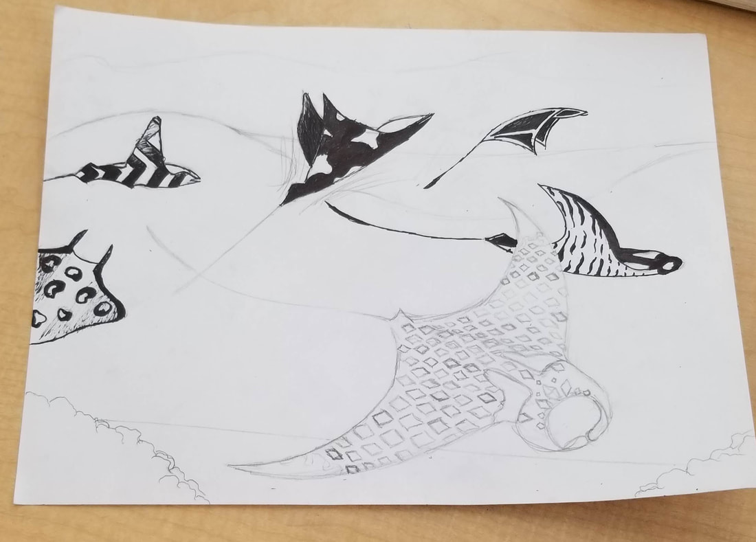
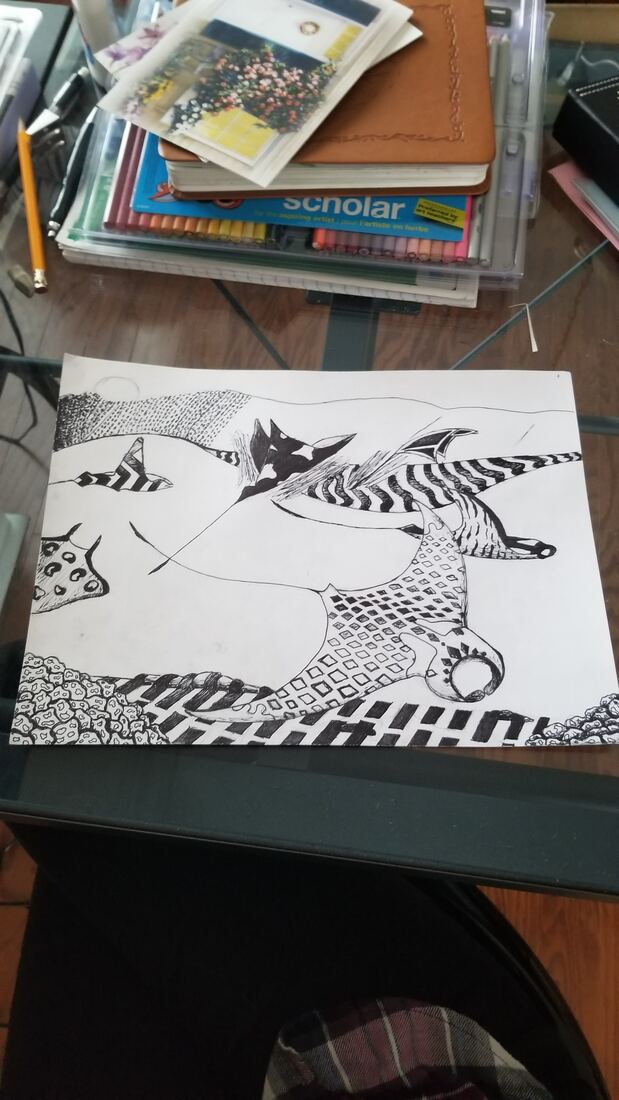
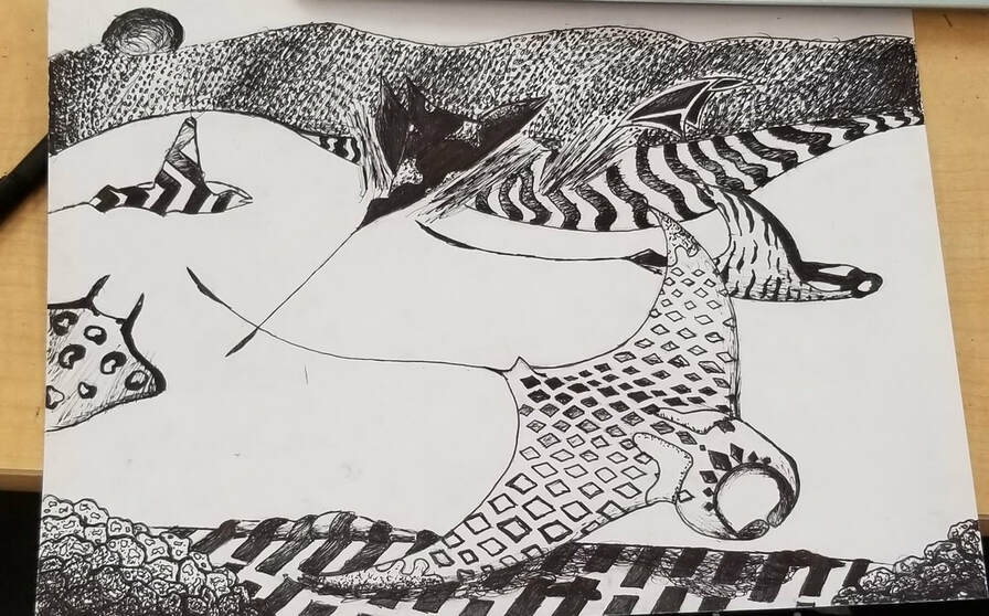
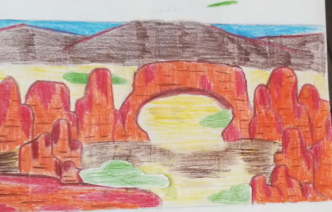
For my values I tried to create value as if the sun was shining through the water on to the stingrays and have one of the stingrays cast a shadow. I also created value to show the general round shape of some of the stingrays.
For the pen techniques I used a small sharpie pen. Sometimes the ink would dry out as I drew creating strands of dry marks everywhere making it difficult to draw over it.
For the patterns I took some designs from my 100+ pattern drawings and used them in my final. I ended up having to make some of my patterns much bigger or smaller than they originally were on my 100+ drawings to create the right values and textures so the image wouldn't all just blend together. I wish I picked some more medium patterns so then I could create more value with them.
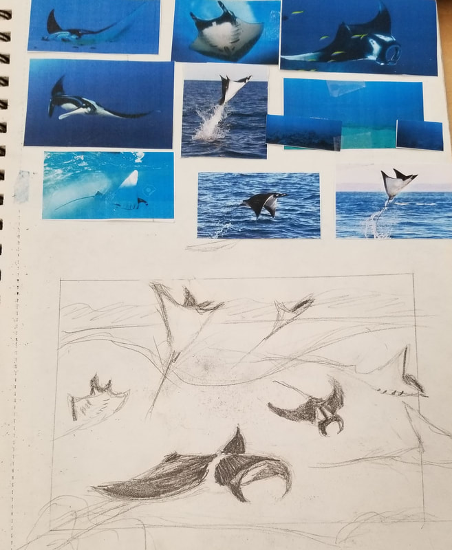
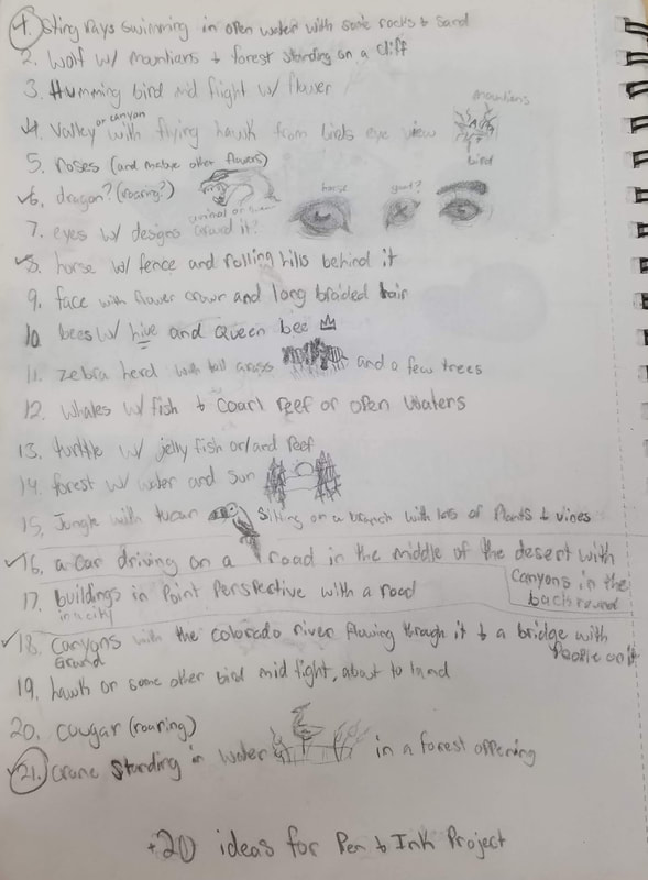
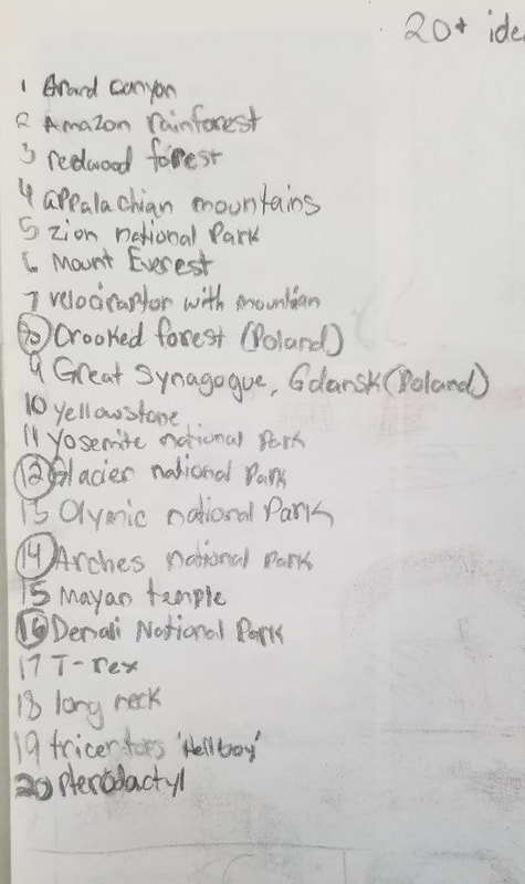
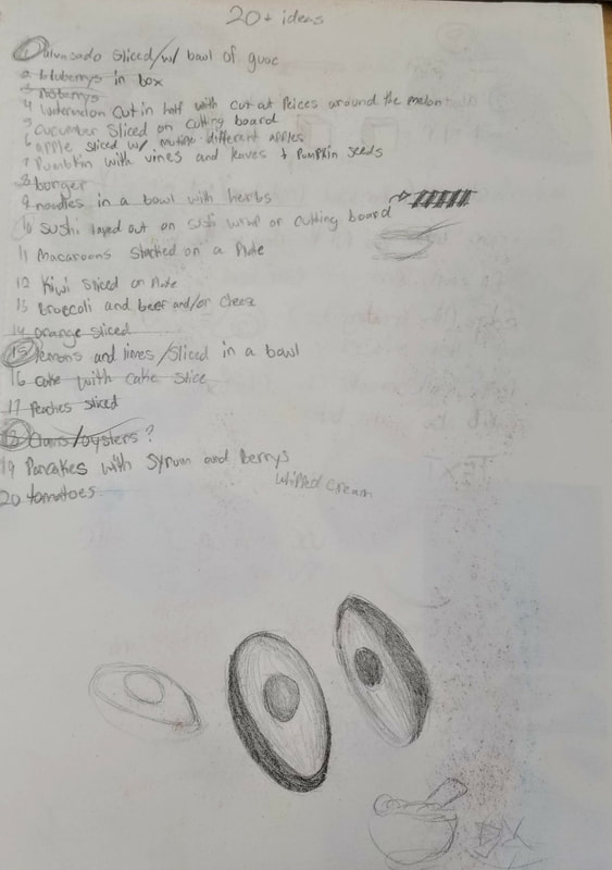
First I made a list of 20+ ideas (top far right) for my project to find what I liked best. I deiced to go with the sting ray idea. My original idea was to just drawing a bunch of random rays swimming in open water. I later decided to draw manta rays because they are known for jumping out of the water and I needed to draw some land so i could create more pattern instead of having a bunch of negative space.
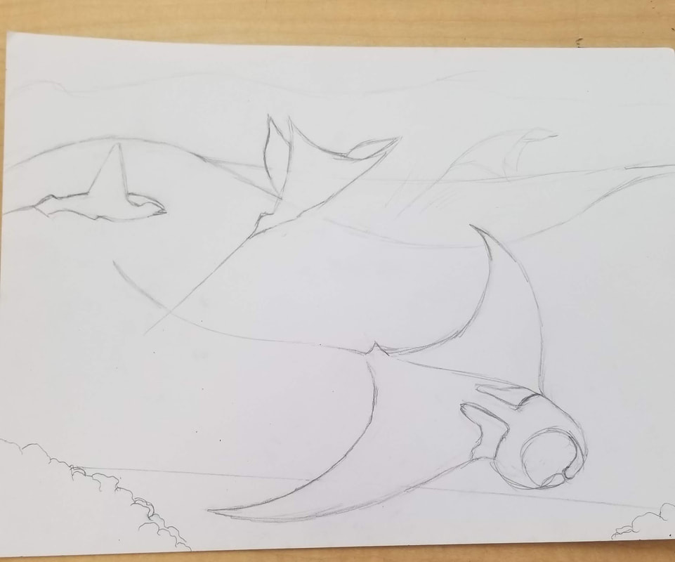
For my final sketch and compositional sketches I drew a bunch of manta rays from the pictures to get a better idea of their anatomy and how they would look at different angles. Then i combined all of the different rays and backgrounds to create my final project
For my compositional arrangement i create some rays swimming off of the picture so nothing was completely front and center.
For the pen techniques I used a small sharpie pen. Sometimes the ink would dry out as I drew creating strands of dry marks everywhere making it difficult to draw over it.
For the patterns I took some designs from my 100+ pattern drawings and used them in my final. I ended up having to make some of my patterns much bigger or smaller than they originally were on my 100+ drawings to create the right values and textures so the image wouldn't all just blend together. I wish I picked some more medium patterns so then I could create more value with them.
First I made a list of 20+ ideas (top far right) for my project to find what I liked best. I deiced to go with the sting ray idea. My original idea was to just drawing a bunch of random rays swimming in open water. I later decided to draw manta rays because they are known for jumping out of the water and I needed to draw some land so i could create more pattern instead of having a bunch of negative space.
For my final sketch and compositional sketches I drew a bunch of manta rays from the pictures to get a better idea of their anatomy and how they would look at different angles. Then i combined all of the different rays and backgrounds to create my final project
For my compositional arrangement i create some rays swimming off of the picture so nothing was completely front and center.
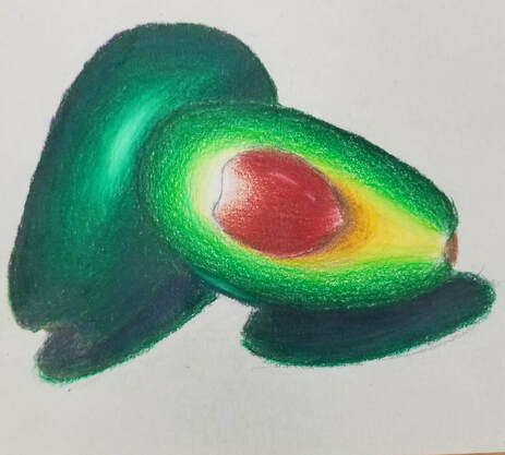
Prismacolor Practice/Final
|
|
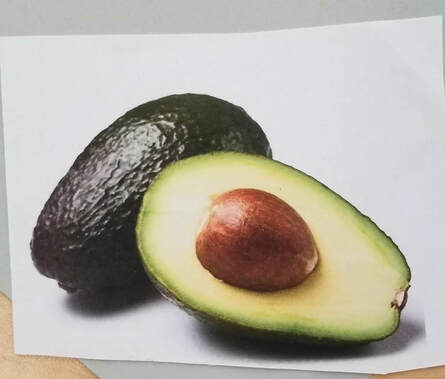
For this project i decided to use the avocado as my reference because I found using mostly lighter colors was easier to see on the grey paper. I decided not to use the brown or black paper because they were both to dark and the yellow coloring would have been hard to see on either paper. The 3 bottom pictures are my practice drawings with prisma colored pencils. I liked using the prismas because they were easy to blend and they pop with amazing color and saturation
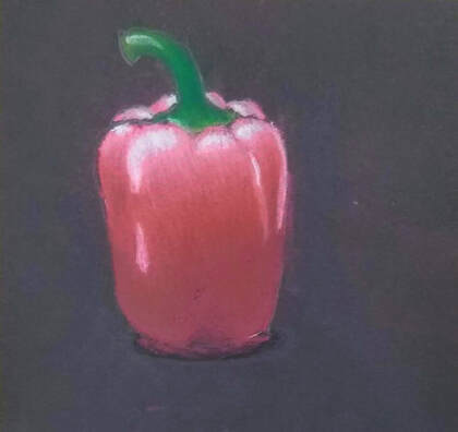
Pastel practice and final
|
|
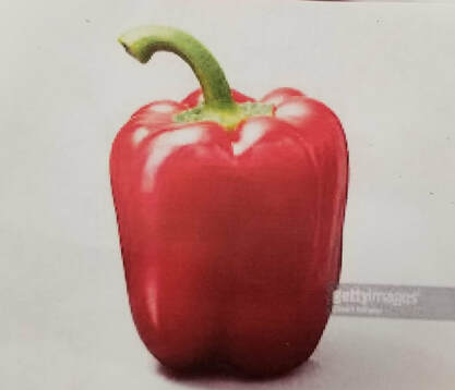
For this project I decided to use black paper for my final chalk drawing because the chalk showed up the best on the darker paper. I decided to use a red pepper as my reference because I liked how the use of red and pink showed up on my practice drawing. The chalk was a little harder to mix and blend then the prisma. It was very messy and hard to keep from smudging. For my final drawing I used different shades of red and pink and I used dark purple and black.
Water color practice and final
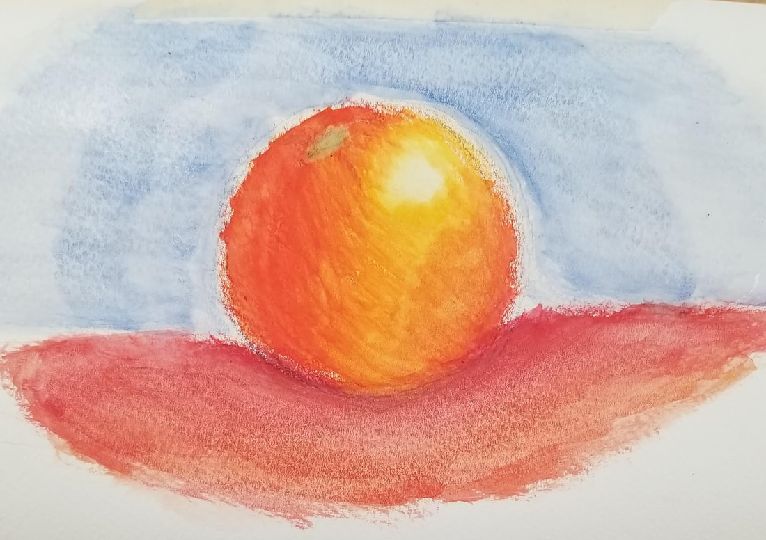
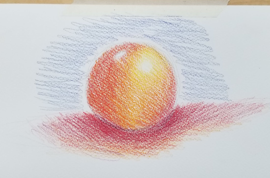
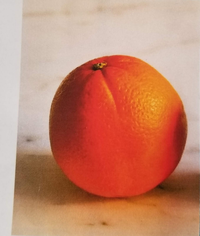
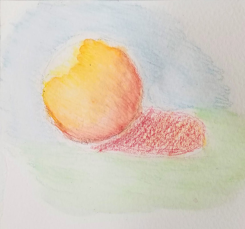
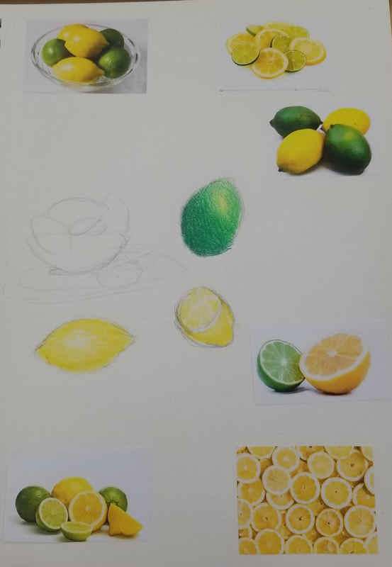
For my water color project I decided to do an orange as my final fruit because I found from my 3 practice drawings that red and orange showed up the best on the paper while the blues and greens were not nearly as visible on their own. For the bottom right sphere I used blue, green, and light green. The light green end up mixing with the darker green and not showing up as much. For the middle bottom picture I used light blue, light green, and yellow. The yellow was hard to work with because it easily mixes in with all the other colors. For the bottom right picture i used red orange and yellow. The yellow was also easily over taken by the orange and red in the rest of the sphere.
Prisma Color Pencil Final
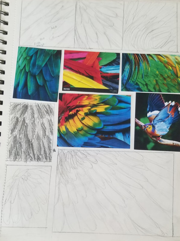
For this project I decided to do bird feathers because they can come in many colors and shades and this project focuses on color. I decided to use blue and purple as the main colors for the wings because it was easier to blend those colors. I found it more difficult to blend the darker blue and purple then it was to blend the light and dark blue. I decided to use a mix of darker colors as the background to try and make the feathers of the wing pop. I wish that i made the background darker so the feathers would pop better. It was very hard to proportion the 2nd layer of wings with the first layer.
Printmaking unit
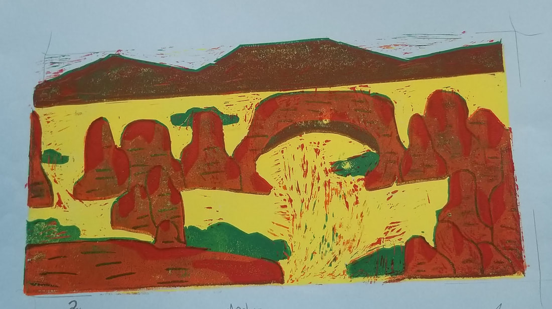
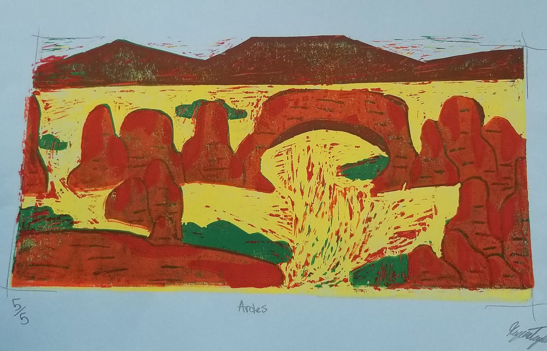
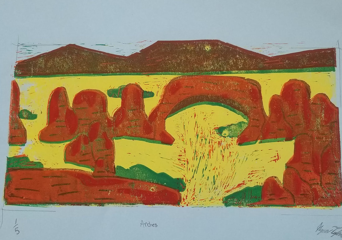
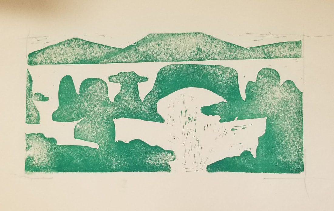
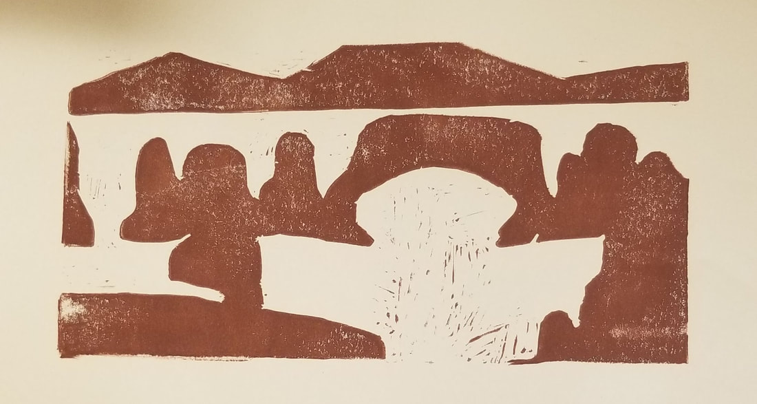
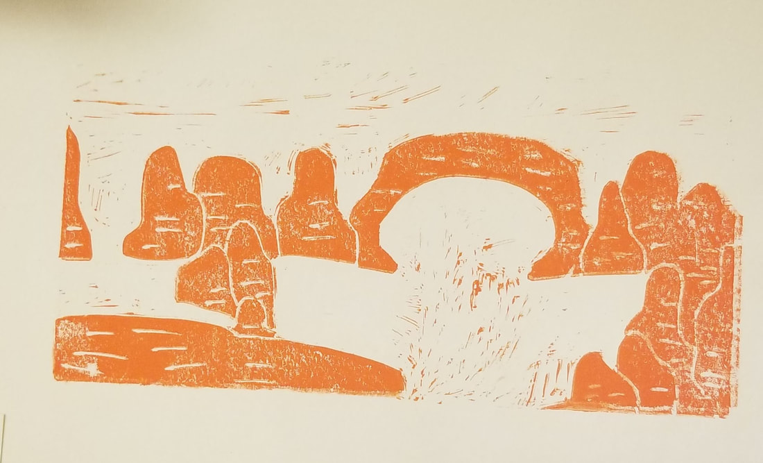
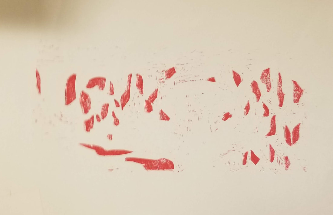
- Describe the craftsmanship of your project: I feel I could have done better with the carving and registration because I kept trying to carve out the big empty area but paint would always get onto the paper but I feel like I probably could have carved in a little bit more. The registration was sloppy and I feel like I could have tried harder to line up all of the prints to make it a clean cut image.Some of the paints were very thin and it was very hard to apply a solid layer into the portrait to create solid coloring. If I could re-do it again I would try different methods to easily apply more paint.
- How did you use texture, color harmony and balance to define your choice of subject? For the texture I tried using the red patches and the brown lines to highlight the different forms of rock. For the color harmony I tried using warm colors to try and give the image the desert feel of the Arches.
- If you could recreate your pieces what would you do differently to enhance your final outcome? I would recreate mostly my entire project. I would make the arches more detailed and 3D instead of flat. I would also be more careful about my registration and I would choose more unique colors that flowed together better to create an overall better outcome.
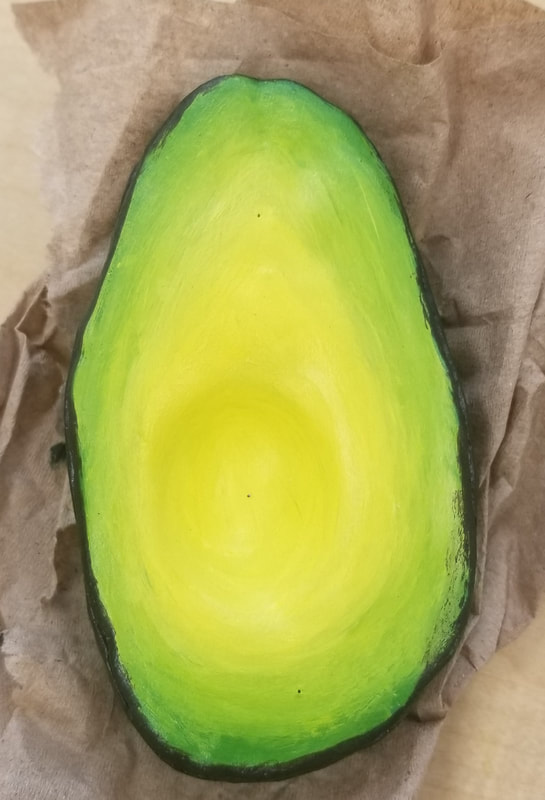
Clay Food Project
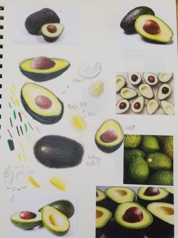
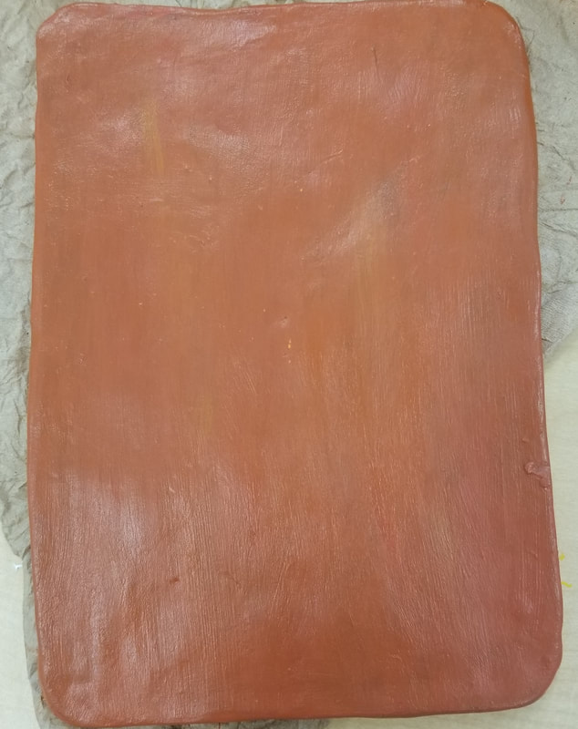
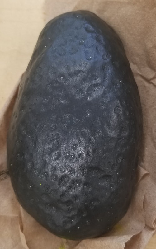
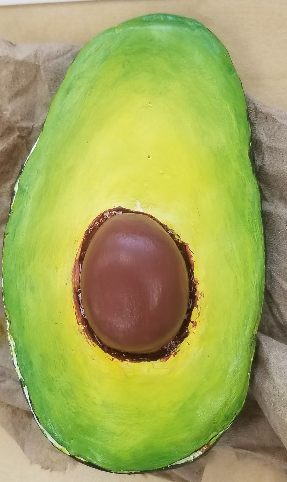
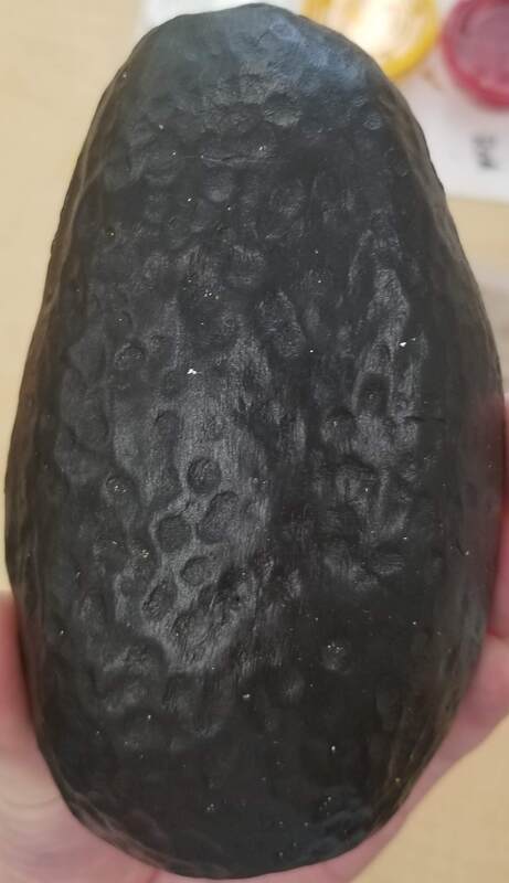
- I think i could have done a little better on the craftsmanship. I would make the avocado thinker and a little bit more round to create the right shape. I would also completely redo the cutting board to make it look more like wood.
- The most difficult part about this project was making the whole slice hollow while also creating a space for the seed. it was also hard to get the hole in the slice to match the size of the seed.
- I feel that for the avocado my color choices did work together well. I used a mix of yellow, dark blue, red, and black for the skin of the avocado. For the avocado itself i used yellow and light blue and some with to create the light green to light yellow ombre.
- I think that my sculpture looks interesting from all views. I added texture to the back of the avocado and I painted ombre on the front.
- The difference of constructing something from 3D than 2D is that you have to study all angels of what you are creating instead of just looking off one side of the object and drawing it. It is also much harder to create proper proportions of the object in 3D than 2D.
- I created the texture of the warts of the avocado with pressing my thumbs into the clay. I also used the back end of a paint brush the create the dents. for the smooth parts of the avocado I used a sponge to create the soft texture of the inside of the avocado
- I believe my sculpture looks like an avocado. I accomplished this by mixing just the right colors for the clay to make it look like an actual avocado. I also made the wart like texture on the skin to created the lumpiness of an actual avocado.
- If i were to make this project again I think I would make the avocado thicker to give it a more realistic look. I would also paint less green in the middle and add more yellow to give the avocado its natural color. For the cutting board i would create a lighter color to make a more wooden look.
Color wheel/Value charts
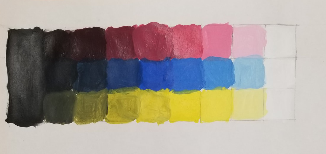
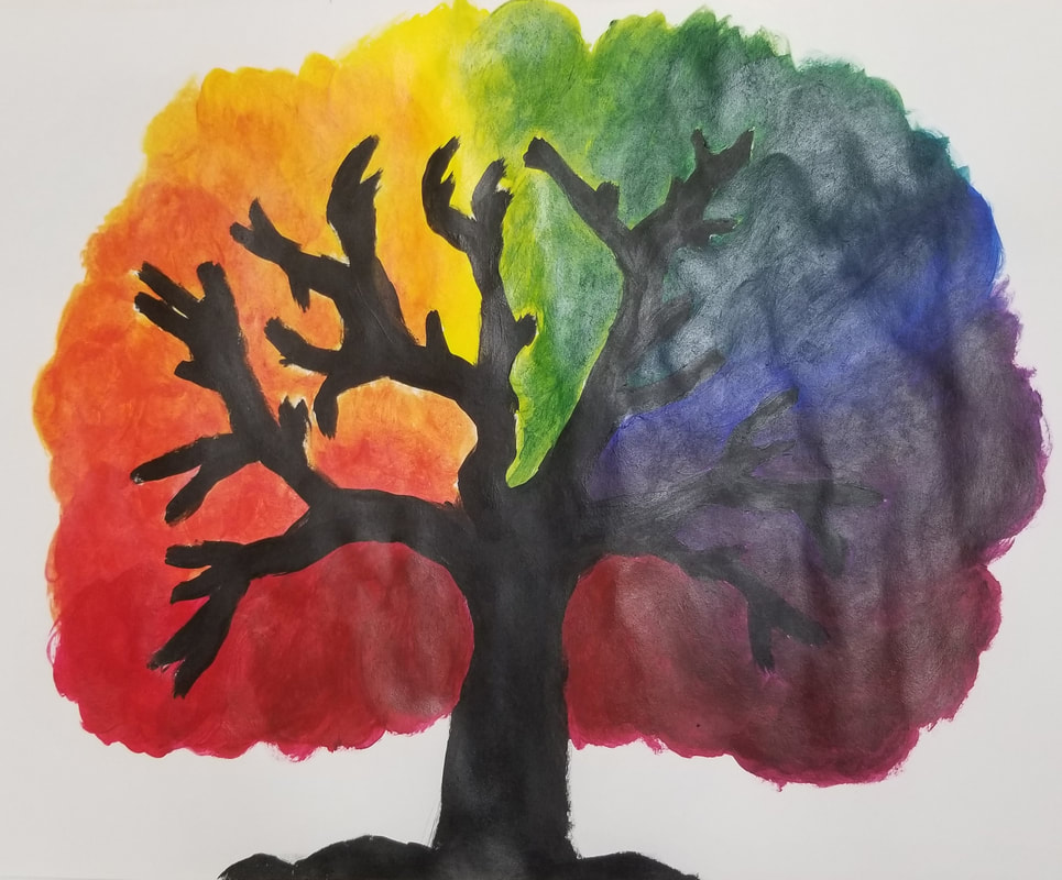
For this color wheel project I decided to make a tree out of the color wheel because I knew that coloring the leaves of the tree would provide more space for the colors and blending. For blending the colors on the value charts i started out with white and over time would slowly started adding yellow. Then I would start adding black to the original color until i got all the proper shades. For blending on the tree I would start with the primary colors and start adding the other primary colors little by little until I got my secondary colors.
Juan Gris Paper
Candy Still life
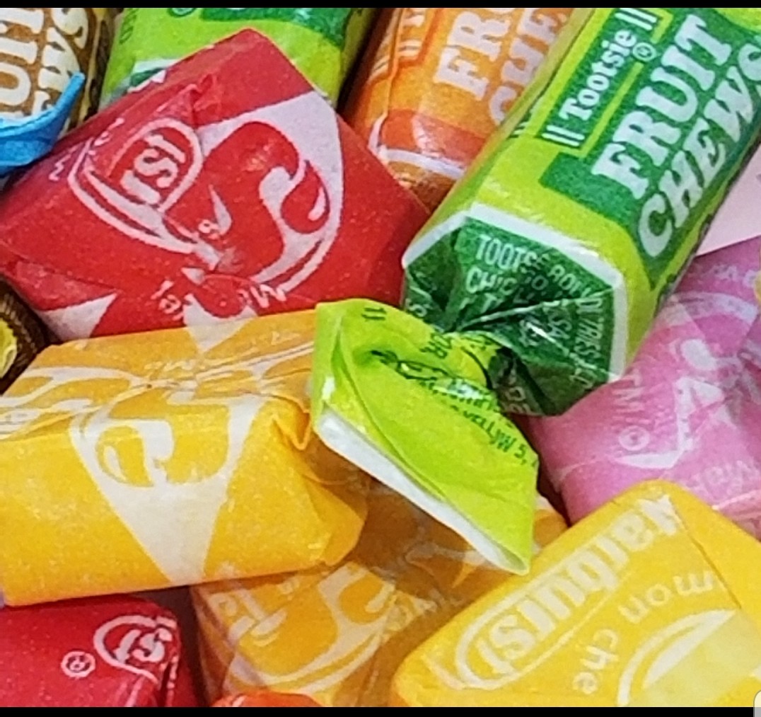
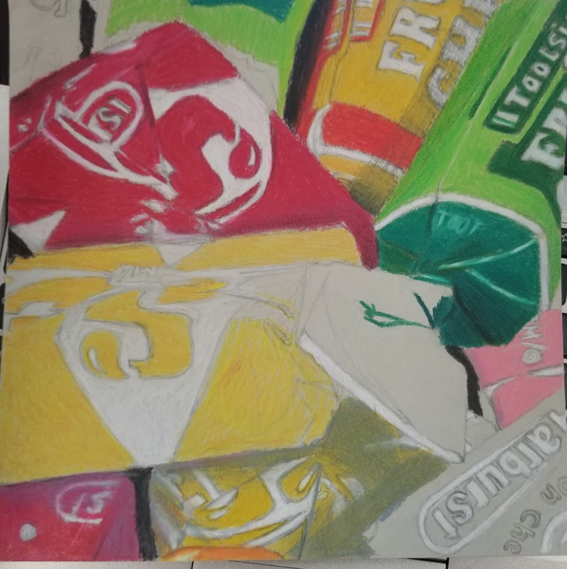
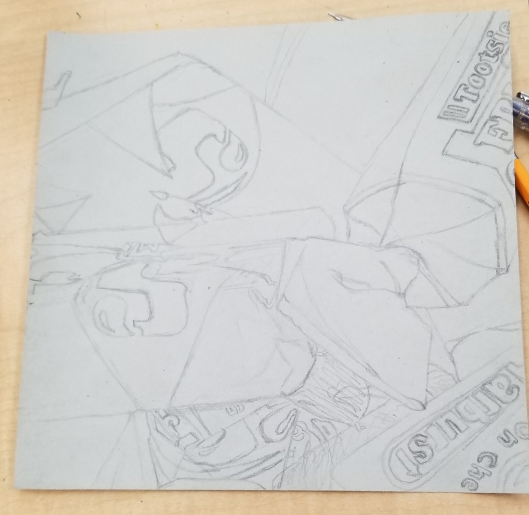
For my candy project I re-created the image (far left) with prismacolors. I found it difficult to find the right colors to shade the objects in the drawing. nf
